Case study
NutriSenior: a name, a brand and a website for geriatric nutrition in Santiago
A new business with no name, no website and no clear market got the research, the brand and the site to start with a plan.
Geriatric nutritionSantiago, ChileSince 2024nutrisenior.cl(opens in a new tab)
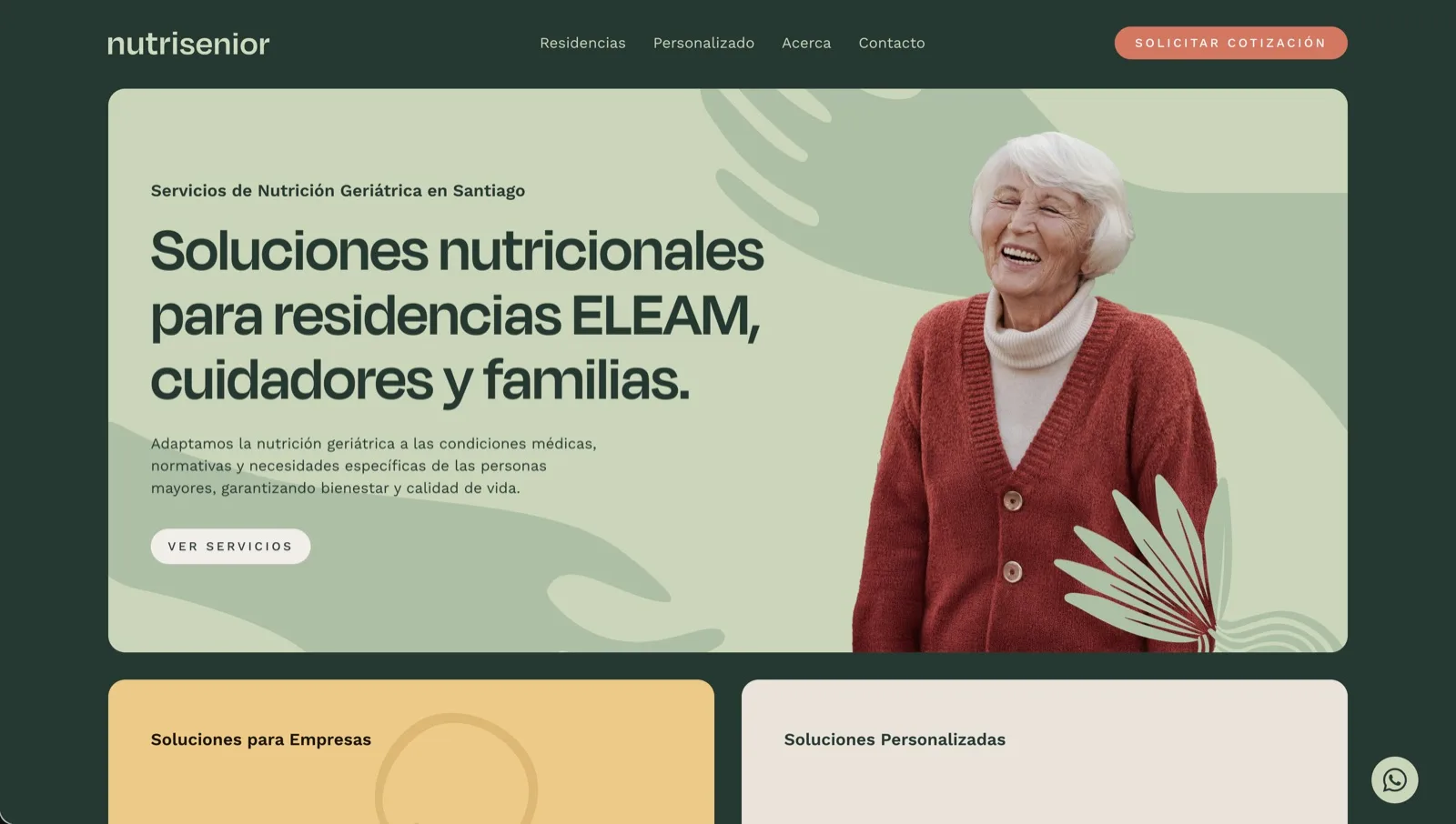
NutriSenior is a team of three nutritionists in Santiago, Chile, who specialize in geriatric nutrition. Lucas Cubillos Mialani of Cubilani, a brand and web design studio, researched their market, named the business, designed its brand and wrote and built its website in Spanish. The research found the audience to lead with: care homes for older people. The site gives care homes and families each their own path to a quote.
Three nutritionists, a new business model, and no website yet
The team is three nutritionists, Danaee Anais, Andrea Valenzuela and Catalina Cuello, who all work in geriatrics: they look after older people’s nutrition, and they guide the people who care for them. Nutritionists are nothing new in Chile, but a business built around older people’s nutrition, sold to the places and people who care for them, was. They had no website, the business itself was just starting, and its name wasn’t settled yet.
That raised a question before any design: who exactly is the client? Here the client and the person who benefits are different people. The one who pays is whoever cares for an older person; the one who benefits is the older person.
Research first: who pays, who benefits, and where to start
So the project started with market research: a full study of the market, the competition, the audiences and their buyer personas, what NutriSenior could offer and how, and the objectives to aim for. My MBA in business and marketing came in handy here.
It found three audiences: care homes for older people, families looking after an older relative, and older people living on their own who want to look after themselves. Care homes were the opening. In Santiago, geriatric nutrition came folded into something else: clinics offered it inside general geriatric care, and independent nutritionists among everything else they do. No one offered it on its own. The research also mapped the long-term care homes for older adults across the city.
The research at a glance
- Who pays and who benefits: the people who care for older people pay; older people benefit.
- Four buyer personas: the director of a private care home, the administrator of an ELEAM, a family member caring for a parent, and an older person living on their own.
- The competition: clinics and independent nutritionists, none focused only on older people’s nutrition.
- The plan: the name, the brand and the website first.
The research also shaped the name. The working name pointed only at home visits, while care homes were the main audience, so I recommended a short name that covers both, and NutriSenior was the one the team chose.
The research did more than plan a website. It gave the team a view of the whole business: what’s out there, where they’re heading and how to get there. And it shaped every message on the site.
The main challenge: a logo that works at the size of a favicon
The team had a detailed illustrated logo, rich in colour and small elements, which is hard to read at the size of a favicon or a social profile. The job was a simple vector mark that still felt like theirs, without making it generic.
That’s my goal for every brand. You don’t need a shoe in your logo because you sell shoes, or a lettuce because you sell nutrition. A logo has to be simple and memorable; the positioning comes from the branding work that follows, showing people again and again who you are, until they recognize you at a glance.
A brand built on care, then a site built from the research
Branding: an S shaped like a hug
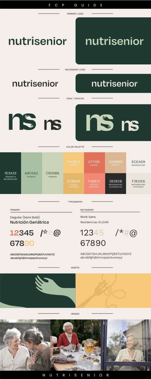
I explored several directions. The first used the N: its shape became a house with a door, for care that happens at home and in care homes, a safe place at a stage of life when people need one. Together we explored the other word in the name, Senior. The S had the shape of a hug, so I reshaped its inner curves into two hands holding each other. The N and that S together are now the brand’s mark and the site’s favicon.
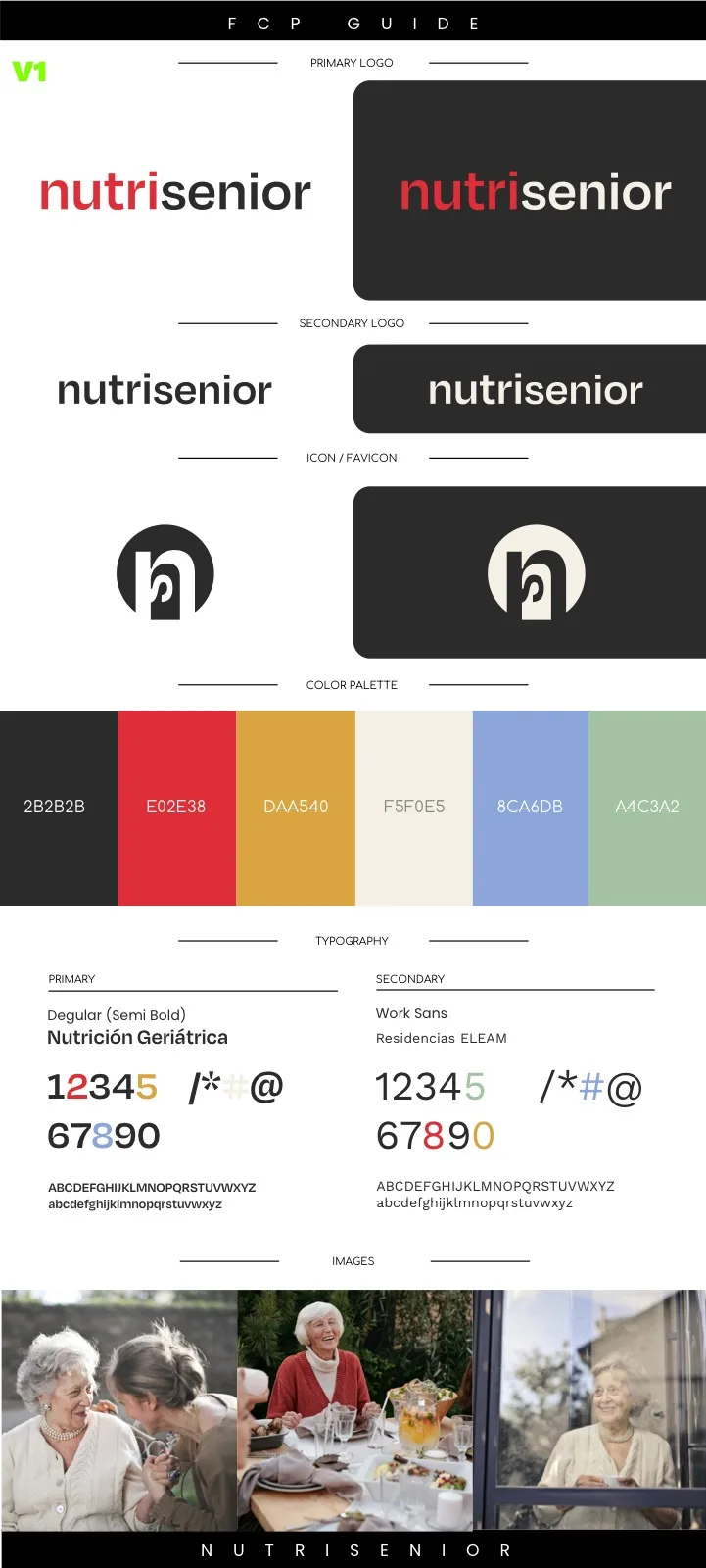
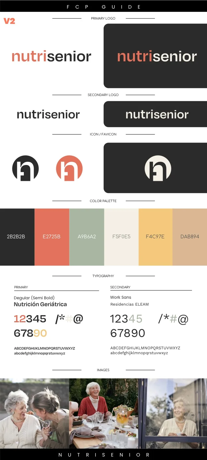
The palette went through three rounds, from bright primaries to the final one, chosen to feel organic, clean and trustworthy: soft sage greens for fresh food and health, a deep forest green for professional trust without the coldness of hospital blue, a warm coral for appetite and human care, and cream, sand and soft gold for the warmth of home. The type pairs a friendly, rounded display face (Degular) with Work Sans for reading.
The brand came as a one-page set of essentials rather than full guidelines: the logo, the mark, the colours and the type, plus secondary elements drawn in the same style: the two hands, a plant, a leaf and a fork with a curl of pasta. The hands repeat across the site’s backgrounds and design details, so the site never felt limited to a logo and two colours.
Website: two paths, one clear next step
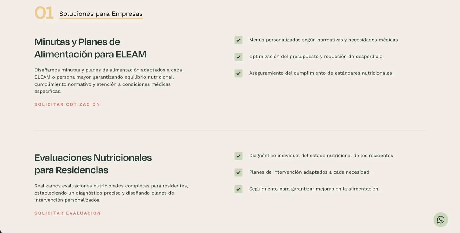
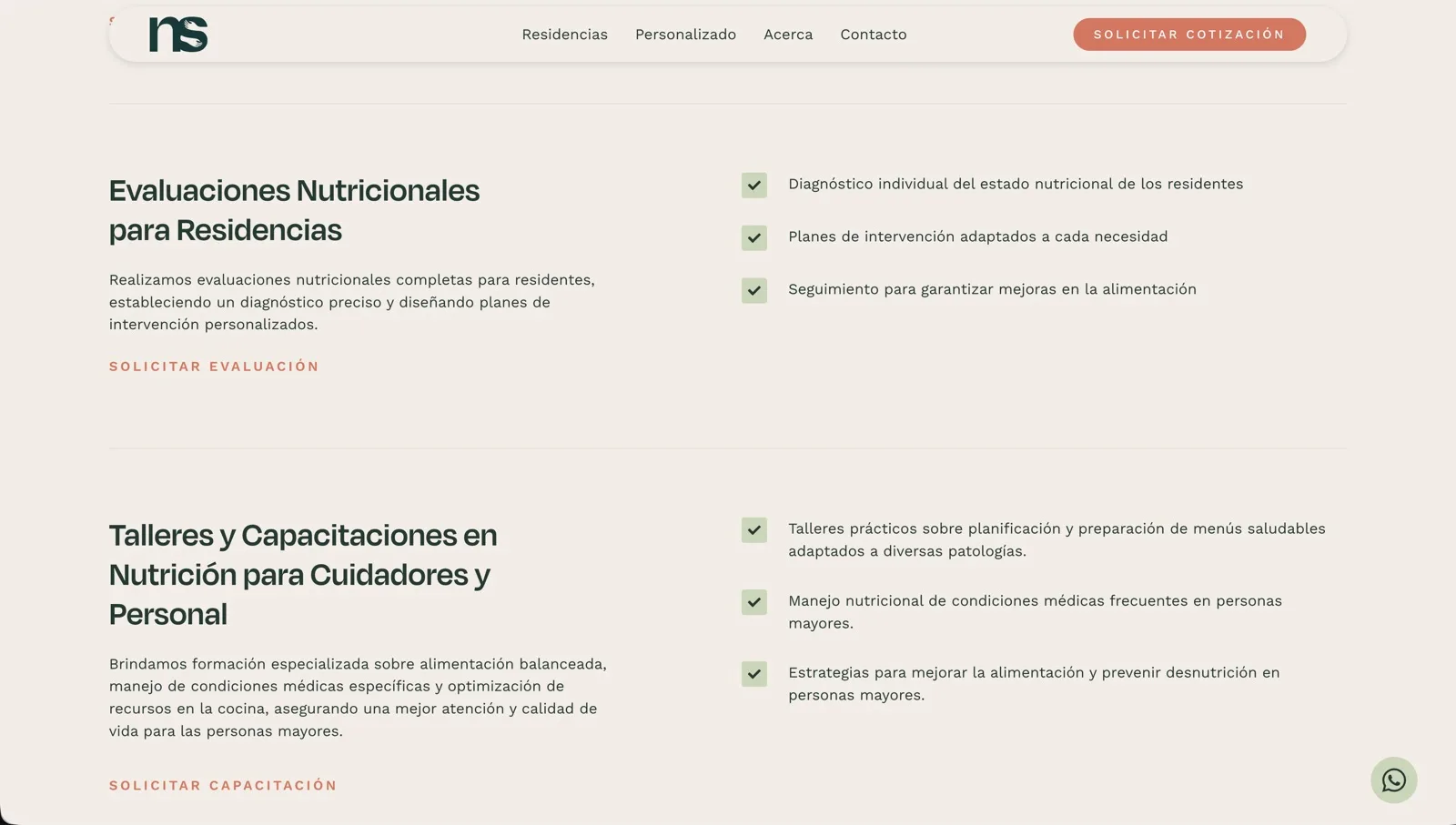
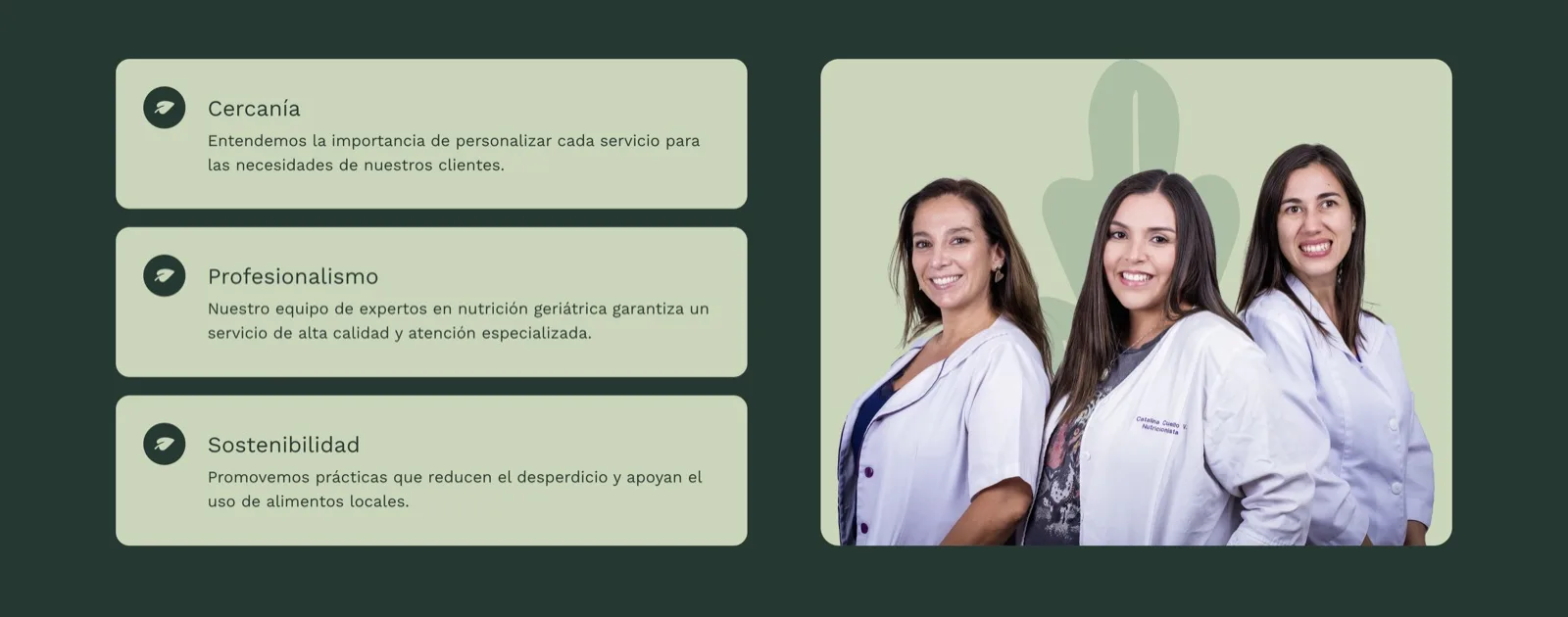
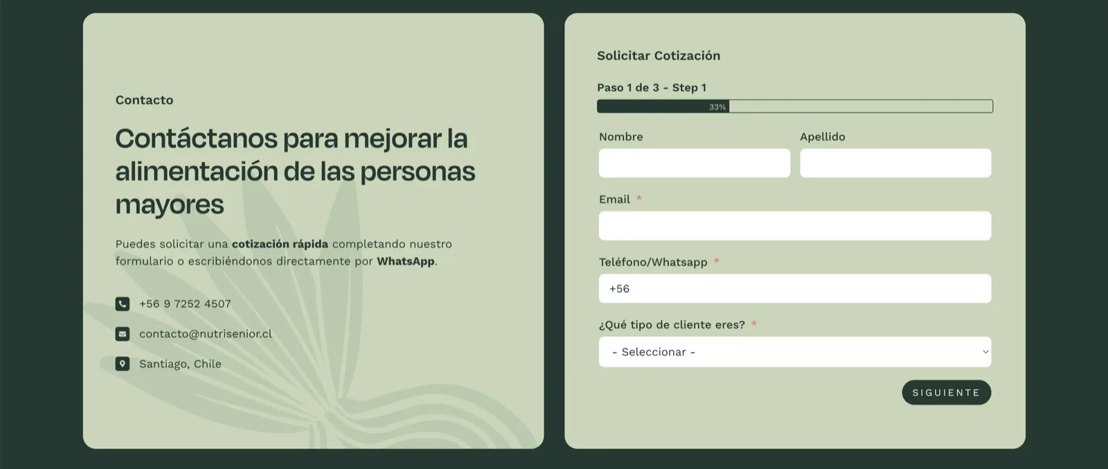
With the research and the brand in place, I planned the site’s structure, wrote all its words in Spanish and built it, in a clean, modern style that carries the same warmth. Care homes get their own path: meal plans that meet the regulations, nutrition assessments for residents, and training for caregivers and staff, each with its own request button. Families and older people at home get theirs: personal assessments and nutrition guidance. Every page ends in a quote request or a WhatsApp message. The quote form takes three short steps and asks what kind of client you are first, so the team knows who they’re talking to before they reply. The team itself is on the site too, so families and care homes see who they’ll work with.
From an idea to a business with a name, a brand and a plan
| Before | After (live since 2025) | |
|---|---|---|
| Market | A new business model, with no clear first audience | A research document: three audiences, personas, competitors, objectives, and care homes as the opening |
| Name | A working name that pointed only at home visits | NutriSenior, short and open to care homes and families |
| Brand | A detailed illustrated logo | A simple mark (an S shaped like a hug), a palette, type and secondary elements |
| Website | None | A site in Spanish with a path for care homes and one for families, quote requests and WhatsApp on every page |
The team was very happy with how it came together: a design that looks right, works, and rests on research that gave a brand new business a clear start.
What Catalina says about working together
“Working with you has had a huge impact on our business. Thanks to you, we created a name and logo for our company and can now showcase our services through the website. From the very beginning, you gave us confidence by listening carefully and answering our questions clearly. You are very responsible and dedicated, and you don’t stop until everything is exactly how your client wants it.”

Ongoing: care for the site, and search in a later phase
I look after the site now, so it stays up, secure and showing properly. Search comes in a later phase. When it does, the research already says which audiences and questions to aim for, which improves NutriSenior’s chances on Google and in AI answers. The setup is the first step; the best results come from ongoing work.
Starting a business from scratch? Start with a free 30-minute call
If your business is new, or your market isn’t clear yet, the plan comes before the design. Have a website? We’ll look at it together the way your clients see it. Starting from zero? We’ll talk through your business and who it’s for. If it’s a fit, you get a fixed-price proposal within two business days.
With or without a website. Free, no obligation, and a reply within one business day.