
Case study
Silo In: a retro sports look and a landing page for a construction talent platform
A talent platform for construction got one idea, a baseball team, and a nostalgic look and page that make it easy to picture.
Construction talent dataCanadaSince 2023silo-in.com(opens in a new tab)


Silo In is a construction talent data company in Canada. Lucas Cubillos Mialani of Cubilani, a brand and web design studio, built its first website in 2023 and came back in 2025 to redesign its landing page around a new concept: a construction company run like a baseball team, with the software as the place where you coach it and pick the right players. He designed the retro look, the image treatment and the collectible player cards, and built the page, its mobile version and the blog templates.
A talent platform for construction, and a first site that set the base
Silo In sells software and consulting that make a construction company’s people and skills visible: who has which experience, which projects need whom, and who could grow into the next role.
I built its first site in 2023: a landing page, a blog with its own archive and post templates, the search basics with analytics and Search Console connected, a mobile version and a short class on publishing posts. It was a clean, blue platform page, designed on the brand Silo In already had.
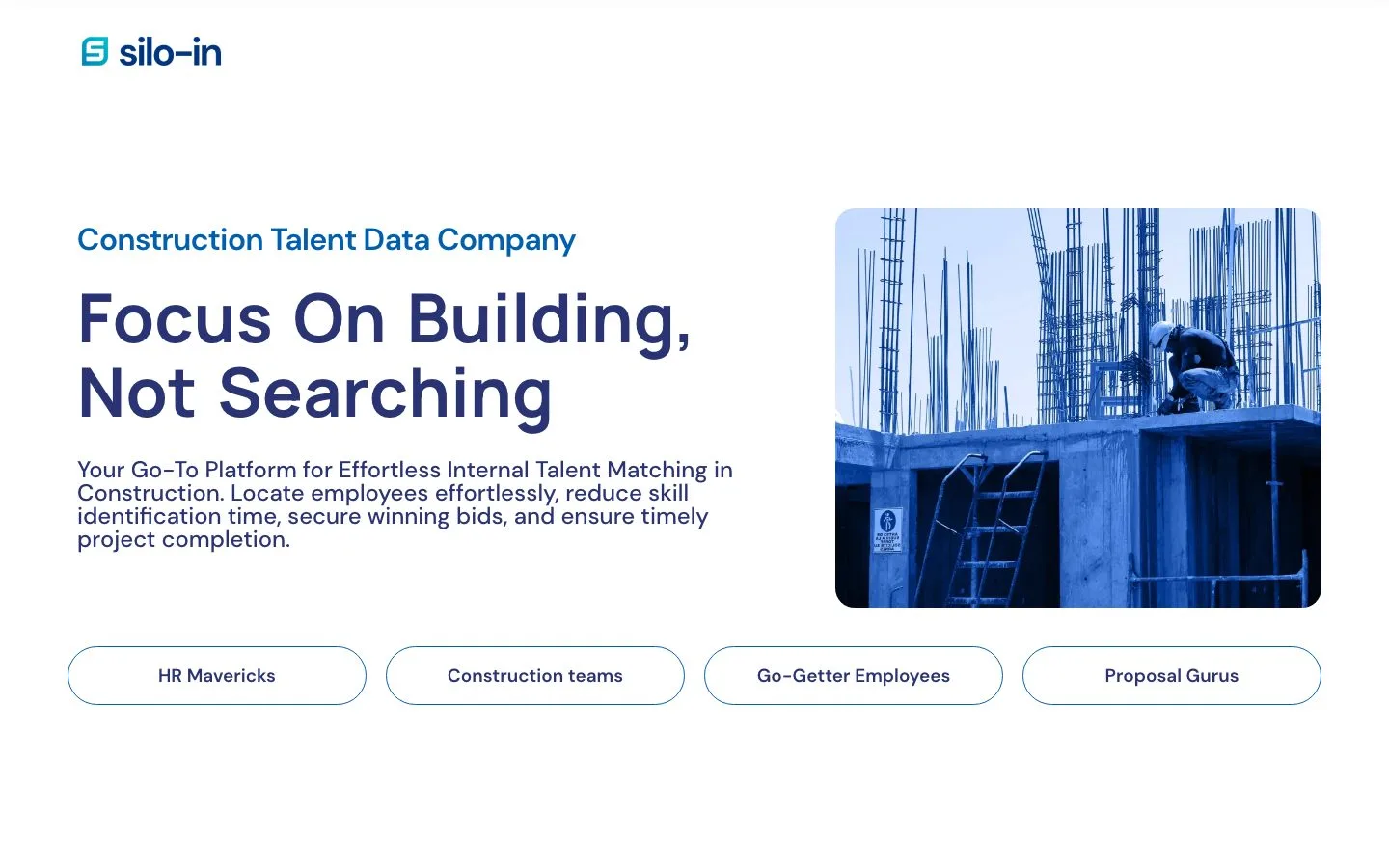
In 2025 the founder came back with a new concept: baseball as the team. The software is where you coach your team and pick the right players, here for construction. A company is a league, each project is a franchise and each employee is a player. The concept and the words were hers.
Together we landed on how it should feel: old-school collecting cards, with a grainy, vintage brand behind them, so it touches the nostalgia people have for their teams. She wanted something more artistic and different from what’s out there. My job was to make it happen: the look, the cards and the page.
The main challenge: making a software idea one clear picture
Software about people, skills and projects is hard to see from the outside. There is no object to photograph and no product shot that says it in a second. The league idea can do that, but only if the page shows it at once: in the first screen, in three short cards and in a few faces, instead of in paragraphs.
It also had to look unlike the software around it. So the design had two jobs: make the idea readable in seconds, and give it a nostalgic, artistic look in which sports and construction feel like one world.
A look that carries the idea, then a page built around it
The look: a retro sports program, in green and paper
I started from Silo In’s brand and extended it into a retro sports look, grainy and vintage on purpose. The headings are set in a tall, condensed face (Bebas Neue) over a warm paper background, with dark green, a bright teal for the buttons and DM Sans for reading. Textures, frames and photo overlays give it the feel of an old ballpark program.
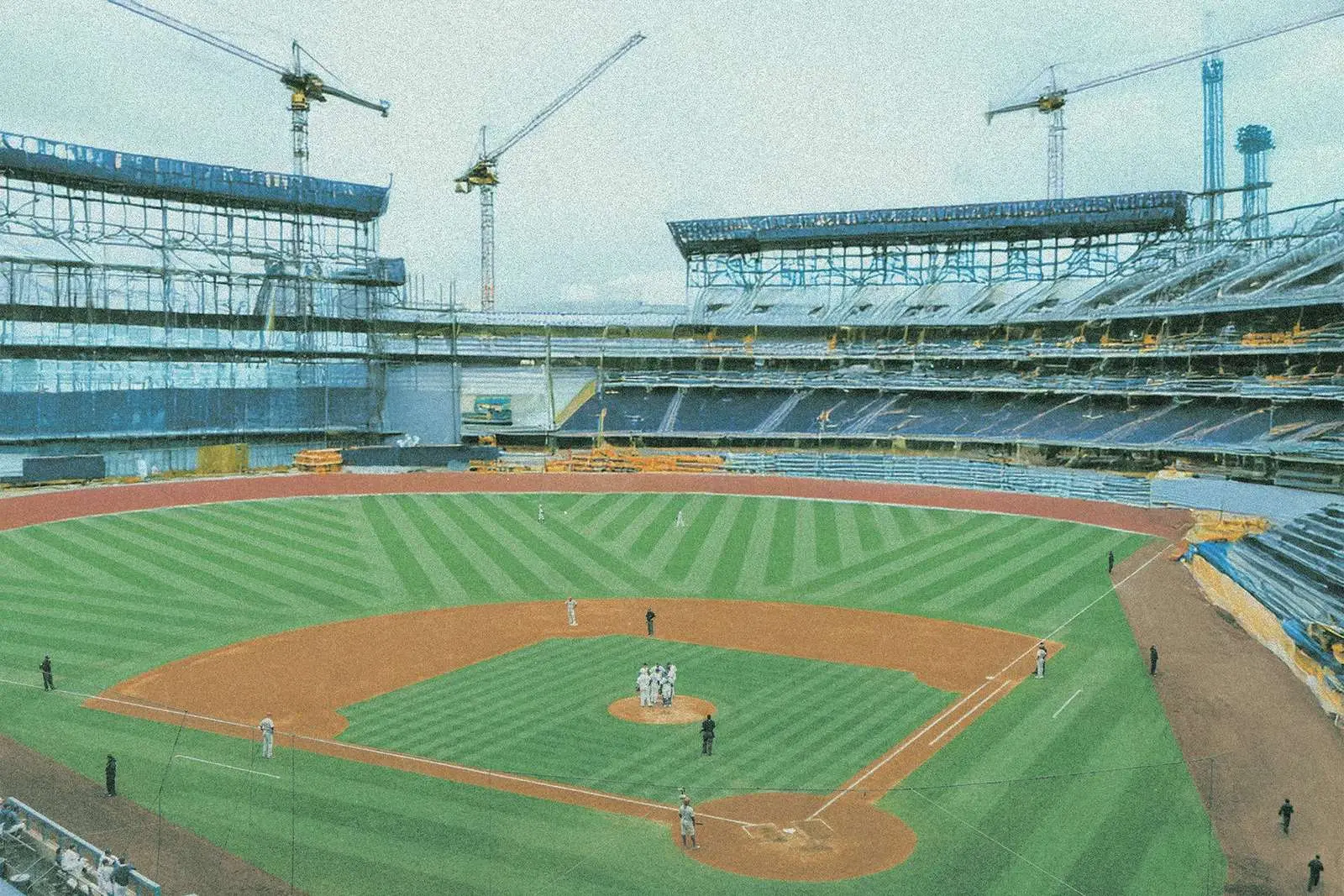
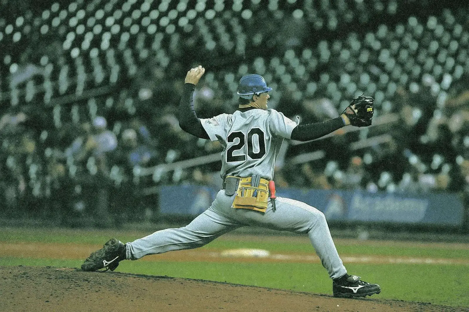
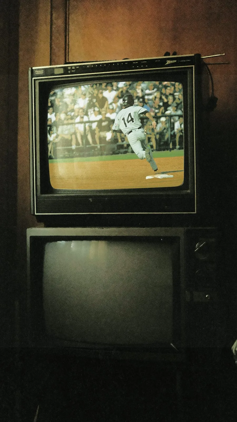
The image treatment ties it together. Players, stadiums and construction gear were treated with the same grain and faded colour, so they read as one set: a pitcher in a hard hat and a tool belt, an old television playing a game, a green chalkboard behind the text. The first screen puts a ballpark under construction, with cranes over the stands, so sports and construction share one picture.


Branding services, planned with the website
The cards: employees as players
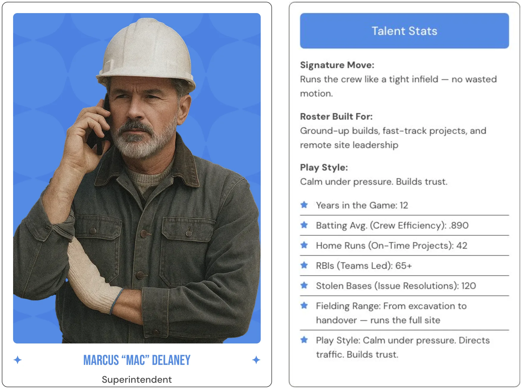
To make “employees are players” something you can see, we chose the old-school collecting card, and I designed the profile cards in that style: a portrait, a role, a signature move and a stat line, with a superintendent, an electrician and a project coordinator as examples. The stats are in the founder’s words and in the sport’s language, with a batting average for crew efficiency and home runs for projects finished on time. The cards turn the idea into something people can scan in seconds, and something they might want to collect.
The page: from the league to one call to action
The landing page walks from the idea to the offer: the league and its three cards, the gap in construction talent, what the platform does, three phases for starting small and growing, then a demo request and a contact form. It works on phones and tablets, and I restyled the blog archive and post templates to match, so the blog feels like the same company.
From a platform page to one idea you can picture at a glance
| Before (January 2025) | After (live since 2025) | |
|---|---|---|
| Headline | “Focus On Building, Not Searching” | “Manage Construction Talent Like a Pro” |
| The idea | A platform page with four audience tags | One idea, the pro league, explained in three cards |
| Look | Bright blue on white | Grainy and vintage: dark green on warm paper, with a ballpark under construction |
| People | None | Profile cards in the style of old-school collecting cards |
| Blog | Archive and post templates | The same templates, restyled to match |
Silo In came back for this redesign two years after its first site, and the page is live today.
Two projects in two years
The first site went live in 2023 and the redesign followed in 2025. The blog templates from the first project were restyled, not rebuilt, so the blog carried over into the new look.
A page that explains your idea in seconds is also the base for being found. See how AI SEO services work
An idea that’s hard to explain? Start with a free 30-minute call
If your business does something people can’t see at first glance, the picture comes before the page. Have a website? We’ll look at it together the way your clients see it. Starting from scratch? We’ll talk through what your business does and who it’s for. If it’s a fit, you get a fixed-price proposal within two business days.
With or without a website. Free, no obligation, and a reply within one business day.